



Table of Contents
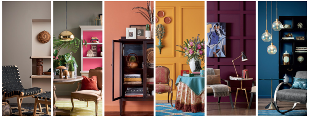
Colors are story weavers, each resonating with different emotions, energy, and essence. While bold and vibrant interiors steal the spotlight on social media such dynamism is often seen missing when it comes to applying it to our personal space. Many lean towards a more neutral palette, admired for their simplicity, understated elegance and often perceived as a safer option. However, the principle of color theory helps us understand the endless possibilities within every shade, showing how thoughtful applications can infuse spaces with personality and allure. Let’s uncover how to incorporate color theory in interior design to create a space that reflects individuality and style.
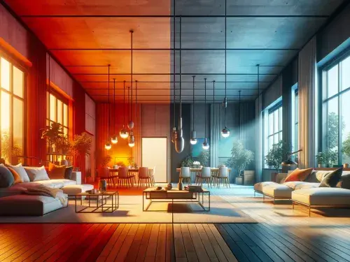
Understanding of color theory in interior design begins with how hues, tones, and contrast impact the mood and energy of a space. In the color wheel, colors are classified into warm tones and cool tones, warm tones such as reds and oranges infuse energy and vitality in a space, while cool tones like blues and greens create a calm and serene atmosphere. When chosen thoughtfully, colors can add vibrancy to a space and a harmonious color scheme has the power to elevate even the most understated interiors.
Beginner's guide to color theory for interiors

Choosing paint colors for interiors can be a daunting task. The basics of color theory revolve around understanding how colors, contrast and complement each other. By applying these principles, you can create a space that feels cohesive and visually balanced. Mastering color theory in interior design helps to achieve an understanding of harmony, unity, and emphasis that ultimately enhances the overall aesthetic of space.
A color wheel consists of the following:
Primary colors – Red, Blue, and Yellow are the primary building blocks of all the colors. I.e. that cannot be replicated by mixing other colors.
Secondary colors – Secondary colors are the colors made by mixing two primary colors. I.e. Orange, Green, and Purple.
Tertiary colors – When mixing together primary color with secondary color to create a different shade is called tertiary color ex. mixing blue and green results in a tertiary color teal.
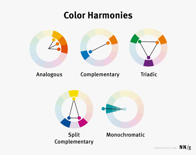
Complementary colors – Complementary colors are the colors that sit opposite each other in the color wheel.
Analogous colors – Analogous colors are the colors that sit side by side in the color wheel.
Monochrome colors -Monochrome color schemes are based on a single color presented in various tints and shades. Shades are a darker version of color created by adding black and tints are lighter shades of color created by mixing white.
Split complementary colors -In split complementary colors instead of using two colors directly opposite each other on the color wheel, you use the two colors adjacent to the complementary color, creating a triangle as shown above.
Triadic color – Triadic color is a color technique that uses colors that are evenly spaced out on a color wheel.
Neutral colors – White, black, grey, beige, and brown are neutral colors that can effortlessly complement and enhance any other color in the room.
What is the importance of harmony, unity, and emphasis in design?
Harmony – Harmony in color in interior design refers to the balanced use of colors that complement each other, creating a visually pleasing and cohesive atmosphere throughout the space.
Unity in color in interior design refers to the harmonious combination of colors that creates a cohesive and balanced look throughout a space, making all elements feel connected and intentional.
Emphasis – Emphasis in color in interior design involves using a bold or contrasting color to draw attention to a specific area or feature, creating a focal point within the space.
Applying Color Theory to Interior Design
Understanding how to use color theory in interior design is a key fundamental skill to create harmonious and visually appealing spaces. To implement it in any space the first step is to determine the desired mood for each room. Consider the purpose and function of the space and how you want it to feel.
Here is a step-by-step guide to creating a color palette for your home:
As said to create a color palette for your space, begin by defining the room’s purpose and mood. For relaxation areas like bedrooms or bathrooms, opt for cool tones like blues and greens, while warmer tones like reds and oranges work well in active spaces like living rooms or kitchens.
Start with a primary color as the foundation, then choose complementary or analogous colors that suit the tone of the room. Incorporate accent colors to add interest, and use neutrals like whites or grays to balance the palette. Consider the color undertones, as they affect the overall ambiance.
Finally, test the colors in different lighting to ensure they work together, and apply them to walls, furniture, and accessories for a cohesive look. This approach will help you create a harmonious and functional color scheme for your space.
Color Psychology in Interior Design
There is a vital impact of color on mood in interior spaces, they not only shape the ambiance but also influence emotion. Color psychology in interior design plays a vital role in influencing the emotions and mood of interior spaces. Warm colors energize, while cool tones promote relaxation, allowing you to craft the desired atmosphere for each area of your home. Bright, vibrant shades uplift and add liveliness, while muted tones foster tranquility and introspection. Colors also have a direct effect on spatial perception, lighter colors create openness, and darker colors offer intimacy. Additionally, they serve as a means of personal expression, enabling you to design spaces that reflect your unique personality and style.
What are some of the best evergreen color combinations for interior design?
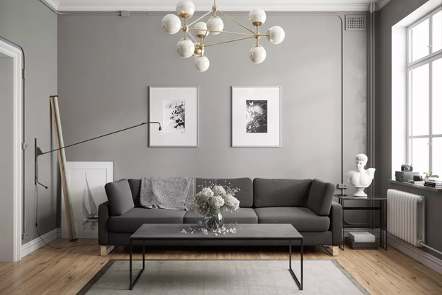
Pairing neutral & bold: Pairing neutral shades like beige, gray, or white with bold colors adds vibrancy without overwhelming the space.
Pairing monochromatics : Using different shades and tints of a single color, such as varying creates a serene and cohesive look.
Pairing pastels & neutrals: Pairing soft pastels like blush pink or light mint green with neutral tones like white or gray create a calming, fresh atmosphere.
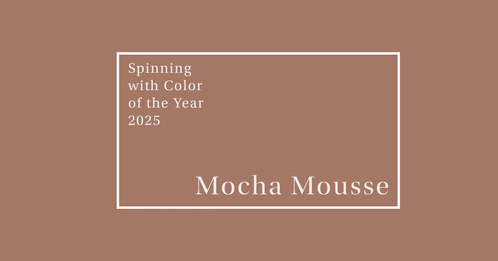
Pairing earthy tones: Warm browns, terracotta, and olive greens evoke a grounded, natural vibe, especially when complemented with wooden textures. These earthy tones are expected to play a major role in interior design in 2025 as Pantone has announced Mocha Mousse as the Color of the Year for 2025.
Pairing black & white: A classic combination that brings a timeless elegance, offering high contrast and clean sophistication.
Conclusion – By having an understanding of color theory a designer can curate environments that evokes specific moods and fuctionaltity of a space. Whether using primary, secondary, or tertiary colors, mastering color theory ensures that your space feels cohesive and visually appealing, making it an essential skill for any design project
